A Cut Above
The crisscrossing design of this hilltop house in Rancho Mirage mimics the shape of the surrounding mountains.
The desert light creates the sharpest of edges. Shadows are deep, verging on black. Despite all the manicured lawns and infinity pools in this luxurious gated community, a sense of wilderness remains in the patchy brown foothills, and on the other side of the chain-link fencing, bobcats, coyotes, and mountain lions still prowl. Early in the morning, you can see bighorn sheep wandering down from the higher rides. They sometimes come right up to the property line, staking out their territory. All around is a landscape of intersecting fissures, steep canyons, and dramatic peaks. The hillsides are unstable, prone to earthquakes, but they are naturally reinforced by native brittlebush with yellow bloom, ocotillo, yucca, cholla, and brightly blooming bougainvillea.
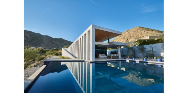
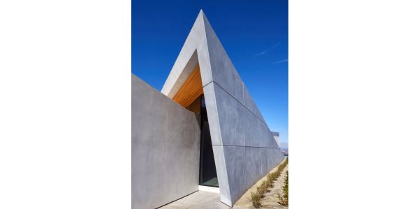
As one moves up the hillside from the low vantage of a looping roadway, the wing-like walls of the Owen house appear to shift and erupt as perspective unfolds and the outer facets of concrete stretch across the plateau, creating the illusion of great length and complexity. The flaring white forms stand out from the surrounding landscape, cutting cleanly across the sky and wild mountain contours. The owners of the Rancho Mirage residence — a couple with two grown children and five grandchildren — wanted to downsize from a 7,600-square-foot house in La Quinta, located 12 miles to the south. They’d first seen Barnes Coy’s architecture in the Hamptons and were impressed by the relatively modest scale and livability of their houses.
After studying topographical maps, the architects stalked the property numerous times. The long, north-to-south axis of the building envelope gave them a basic organizing principle and inspired a crisscrossing geometry. With hardly a thought, Coy picked up a pencil and drew diagonal lines pointing in opposite directions.“It was the first sketch I did,” he recalls. Instantly, this became the core idea, and the rest of the plan evolved from there. What started as a relatively modest, 3,000-square-foot house quickly expanded to more than 5,000 square feet.
The house itself is perched 50 feet above street level on a narrow plateau, 750 feet above the Coachella Valley floor. The overall form was determined in part by local building codes; the city of Rancho Mirage allows a maximum height of only 18 feet above grade for residential structures, so this was a way to create the illusion of increased elevation. Due to seismic instability, the house had to be anchored to the ridge with steel pilings and reinforced concrete footings that are 15 feet wide and more than 5 feet deep in some places
Resisting the urge to mimic local midcentury tendencies — Albert Frey, John Lautner, William Krisel, and other desert modernists — Barnes Coy looked to the more strident and neoclassical forms of Italian modernism for inspiration (in particular, the works of Antonio Sant’Elia and Giuseppe Terragni) with a design that is part temple and part spaceship. The scissor-like composition, with its opposing, fin-like extremities, echoes the shape of two nearby mountains that rise precipitously in the background. These two intersecting wedges give the house its distinctive profile — a 21st century version of the Parthenon, commanding the hilltop site — and are penetrated by a third, more cubic form.
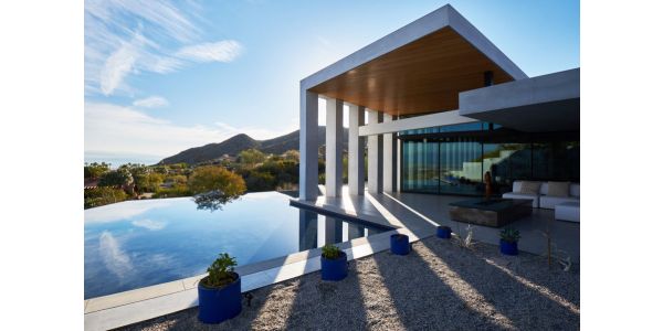
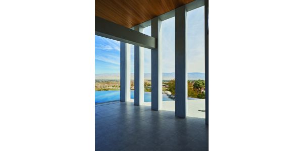
Gill-like openings of the angled colonnade are 16 feet tall but diminish in height as they advance toward the south. It’s a visual trick, something the ancient Greeks understood: Repetition and forced perspective create a heightened sense of monumentality. “The nearby mountains are so huge in scale that we had to create a scale-denying strategy,” says architect Christopher Coy. “The house is only 5,000 square feet but we wanted to create more of a presence. Staggering the distance between the piers makes the house seem three times as big.” In morning light, the piers cast long diagonal shadows across the terrace, like oversized venetian blinds, and make for a moody, cinematic effect.
The main living space opens to monumental views of the valley through 20-foot-wide panels of high-impact glass that slide back and forth on steel tracks. (Each panel is 11 feet high and 6 feet wide.) A trapezoidal infinity pool extends the eye further beyond the property, out past Cathedral City, to the snow-covered peaks of the San Jacinto Mountains. “We wanted to create this view corridor so you don’t see anything else,” Coy says. “It’s kind of like looking down the barrel of a cannon.”
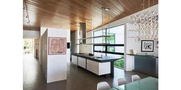
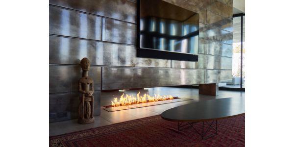
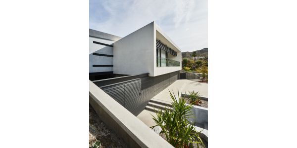
Interior furnishings are low and softly contoured, with muted colors, as if intentionally deferring to the drama of the landscape. Transparent Lucite vitrines hold the homeowner’s collection of antique artifacts — corkscrews, African headdresses, and Chinese and Indian jewelry — as if suspended in midair. White walls, porcelain tile floors, and pale hemlock ceilings reflect ambient desert light, while a 20-foot-long mass of gray steel contains a linear gas fireplace but also serves as a grounding device to help counterbalance the ephemeral nature of the architecture. (Local artisan Kathy Smith fabricated the acid-washed panels.) At the opposite end, the house unfolds to the south with a more cubic geometry. The doors of the four-car garage are clad in a clapboard surface that extends across the entire breadth of the south façade, like a darkly pleated underskirt in contrast to the smooth white stucco surfaces of the upper level. The master bedroom suite is a box-like extrusion that projects over the entry parking area like a separate, autonomous volume. It faces onto a cul-de-sac, which branches off the main roadway and looks to the south from a narrow terrace and all-glass railing. From the street, a zigzagging staircase leads to an entry courtyard in the form of a sunken oasis.
Originally, the entire courtyard was designed to be a shallow reflecting pool with raised stepping stones leading to the front door, but that proved impractical and instead the architects created a gravel-and-cactus garden with palms and banana trees surrounding a fountain from which a rain-like veil of water sprinkles into a concrete cistern. A climate-controlled wine room (with more than 1,300 bottles of vintage wine) and three cave-like guest rooms look out onto this submerged courtyard.
The house stands out from its neighbors, expressing an authenticity rarely found in residential architecture. “We always start from the site and take our inspiration from the conditions: climate, terrain, and light,” Christopher Coy says. “As soon as we saw those mountain shapes in the background, we were inspired to design a butterfly roof that sloped up at either end.” The roof is angled to the south and supports 112 Tesla solar panels that generate 100 percent of its energy.
For Barnes Coy, the design is a fairly radical departure from the firm’s other work, most of which has been built on the East Coast, on or near the beach. Here, they faced a different environment. The shape of the lot generated the narrow footprint while the stretched-out colonnade created a vertical brise soleil to moderate the harsh desert sun. “We couldn’t rely on our normal glass curtain walls,” Coy says. “This project challenged us, but in the end, we feel as if we came up with a breakthrough form.”
Barnes Coy Architects PC
We at Barnes Coy Architects are committed to design innovation and the creation of domestic shelter that celebrates light, space and modern lifestyles. Our award-winning firm was founded in 1993 by Christopher Coy and Robert Barnes. Since then, we have expanded the practice and completed more than 250 projects with offices in Bridgehampton and Manhattan.
We forge a personal relationship with every client to bring their dream to reality. While each design is different, there are certain fundamental themes that run through all of our work. We collaborate closely with our clients and begin with the specific conditions of their chosen site, whether it’s oceanfront in the Hamptons, a desert mesa in the Southwest, or a jungle retreat in Central America. The site generates the design.
We incorporate minimal forms, floor-to-ceiling transparency to capture natural light and rugged textures to create shadows and depth. Light is everything in our work. Curvilinear forms play against rectilinear forms. Volumes penetrate other volumes. The skeletal framework of a house becomes an armature for invention. Structural systems are exposed. Cladding is cut away to reveal inner logic. Rooflines are eggshell thin and cantilevered outwards, as if hovering in mid-air.
While we have a diverse portfolio, our specialty is the single-family house. “Residential architecture is the frontline of modernism,” says principal Coy, who is personally involved in every project, from concept to completion, and works in tandem with a team of twelve highly experienced architects. “Architecture is an integrative art form,” says Coy. “Space acquires meaning when it is layered with intention.”
A major new monograph by Alastair Gordon on Barnes Coy Architects, “Assembled in Light,” will be published by Rizzoli USA in September 2020.
Address:
Box 763, 1936 Montauk HighwayBridgehampton NY 11932
United States
(631) 537-3555
https://barnescoy.com/

